Bias and Pitfalls hurt data science work!
In data science/analytics, sometimes there are pitfalls that will lead you to wrong conclusion (or even worse, misleading conclusions)!
I know I’ve been guilty of falling into these pitfalls myself - it’s human nature! That’s why it’s important to be aware of them, so at least there’s a smaller chance of falling into these pitfalls again.
This blog post will explore some of the more common ones.
Heads up: this blog post is intended to be used as a ‘mini-wikipedia’ for future references (hence the length). Feel free to skip use the table of contents to skip to the section that interests you.
 It is easy to fall in!
Photo by Pexels from Pixabay
It is easy to fall in!
Photo by Pexels from Pixabay
- Bias and Pitfalls hurt data science work!
- Data Biases
- Cognitive Biases
- Data problems caused by inputs and outputs
- Closing Thoughts
Data Biases
Data Bias occur when the available data is not representative of the real world, population or phenomenon we want to predict/analyse.
If the starting point of data science/analytics is incorrect (i.e. the data), then everything downstream is going to be polluted!
As the old adage goes - junk in, junk out!
So let’s explore a few types of data biases.
Survivorship Bias
When you do exploratory data analytics or data science/analytics, generally, incomplete and missing dataset is excluded. That way the effect of incomplete data doesn’t distort the model or analysis.
However, when an entire portion of data is missing from the dataset altogether because it was never collected, in these instances, the missing data may be more important than the available data.
This is known as survivorship bias - where the dataset only represents instances that ‘survived’, rather than non-survivors.
Some classic examples include:
- Examining bullet holes in World War Two airplane bombers to determine effectiveness of armour -
-
During WWII, US planes were constantly being shot down so engineers were tasked with adding in extra armour plating on them.
-
Engineers analysed bullet holes from planes that returned to base and counter-intuitively, they determined that the places that needed the most armour were places without any bullet holes.
-
Why? Because planes that were shot in these critical sections didn’t make it back to base. If a plane survived and returned to base with bullet holes, it means those holes were not fatal.
-
-
Examining hospital admissions after introducing bicycle helmets - there’s an increase of admissions after introducing helmets. Why? Because before helmet, people more were likely to die from their injuries and therefore didn’t get admitted into hospital.
- Successful billionaires and analysing what they did to be successful - majority of business ventures do not reach fruition and therefore the success stories are not representative of whether that particular method will succeed.
The important thing is that available data vs real world conditions may sometimes be very unaligned. In these cases, the analysis should not be just limited to what’s in front you.
A good tip is to assign a unique category/flag to missing values, instead of deleting the entire row of the data or excluding it. This leaves the potential to analysis trends on the missing values themselves in the future.
 Survivors anyone?
Photo by Pete Linforth from Pixabay
Survivors anyone?
Photo by Pete Linforth from Pixabay
Simpson’s Paradox
Another counter-intuitive phenomenon where ‘confounding variables’ distort the results between the aggregate result and the sub-groups of the aggregates. A confounding variable is a variable that was not considered in the original analysis which distorts the value of the results.
When you fail to factor in these confounding variables, you get confounding bias and incorrect conclusions. This will further lead to the Simpson’s Paradox - a phenomenon where a trend appears in several sub groups but disappears or reverses when these groups are combined.
Illustrated example using A/B testing for a mobile app
A/B testing is a very common way of measuring if doing A increases/decreases B. You create two versions of something (in this case the App) and ideally only change the one factor, such as the button colour. The idea of the experiment is to measure which of the two versions performs better:
new button colour (independent variable) -> increase/decrease click-throughs (dependent variable)
Economists have a very common phrase to describe this - ‘ceteris paribus’. In our example, it would be ‘all else being equal’, does changing the button result in an increase/decrease in click-throughs?
Confounding variables may affect this experiment’s outcome - for example, if you only tested this on a particular country and they had cultural values which disliked certain colours. The results of this A/B test would then be ‘confounded’ by these cultural factors.
To illustrate this paradox, here’s an example of A/B testing of an app. After three iteration of versions, here’s the percentage of the App’s users that liked the versions:
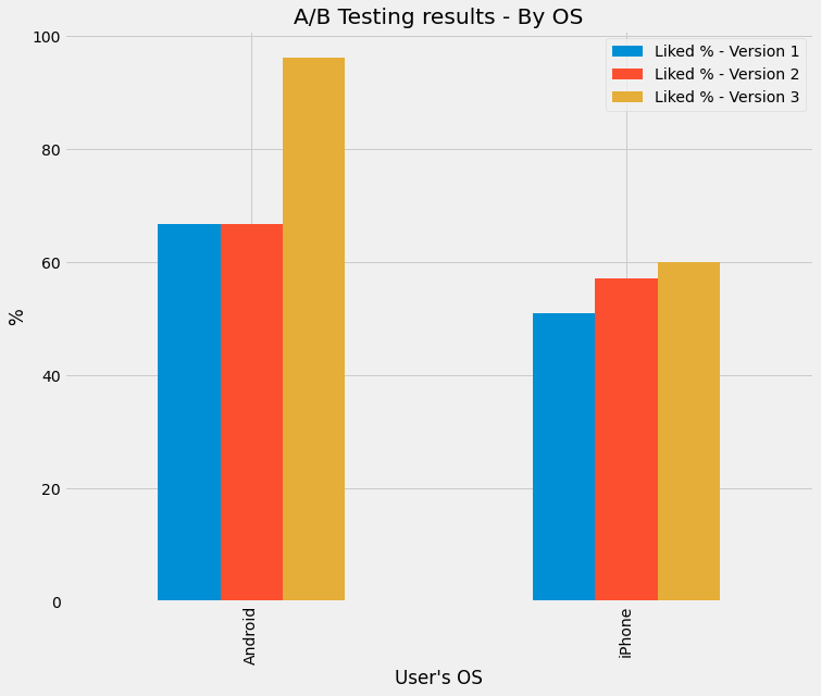 A/B Testing Results - By OS (% of Likes). Created by my Colab Notebook
So looking at it, it seems all good! You conclude that:
- Android is more popular than iPhone
- Both OS have an increase in % of Likes with every version
- Therefore the App is performing well
But wait! Let’s look at the overall trend of likes (as a percentage change) by version:
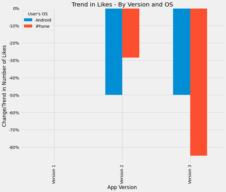 A/B Testing Results - Trend of Likes. Created by my Colab Notebook
That doesn’t make sense - how can % of likes go up for each version, but overall there’s a downward trend!?
Well the confounding variable in this case is the population base of users. If you see the full dataset, you’ll notice that the overall number of users actually declined (that is, people got so annoyed with the new feature they quit altogether):
| User's OS | Version | # of Users that Liked | # of Users that Disliked |
|---|---|---|---|
| Android | 1 | 200,000 | 100,000 |
| Android | 2 | 100,000 | 50,000 |
| Android | 3 | 50,000 | 2,000 |
| iPhone | 1 | 2,800,000 | 2,700,000 |
| iPhone | 2 | 2,000,000 | 1,500,000 |
| iPhone | 3 | 300,000 | 200,000 |
Also, you will notice the vast majority of users are using an iPhone. Therefore, the more correct conclusion is:
- while the % of likes is higher on Android, the vast majority of people who like the product are on the iPhone.
- The number of people who like the App is declining over time.
So be careful of confounding variables! Sometimes trends and correlations show up because there’s something lurking in the back that’s driving the changes! A good way to prevent this is actually to bin the dataset into the confounding variable categories, then recalculate the percentages using a weighted average among all the categories.
For the above example, the population gets re-added into the analysis to calculate the weighted average of the percentages. Therefore, as the population base declines, the percentage will get smaller and reflect the ‘true’ amount of people who like the App.
Great example on Wikipedia
The wikipedia page on Simpson’s Paradox has another great illustration of this - sub-groups have an overall trend is going up, but the overall trend is going down:
 From Wikipedia - by Pace~svwiki - Own work, CC BY-SA 4.0, Link
So keep in mind, whether you are comparing relationships between two values, be aware of a lurking third variable that could skewer the results.
The best way to counter this is slice your data. ‘Slicing’ is in the traditional business intelligence OLAP cube sense where you separate your data into sub-categories and calculate your metrics in these sub-categories separately.
This counters mix shifts, which occurs where each sliced sub-category has a different amount of data. To counter this bias, some Google data scientists have two tips:
- Try to only do comparisons between two groups if both groups have roughly the same amount of data
- Try to always slice by units of time to see if the observations hold true over time.
Data Selection Biases
Data selection bias is when the data itself is biased in some way due to the way it is collected.
A good ‘red flag’ is where your dataset has missing values for multiple ‘columns’/’features’ or for a large number of rows (e.g. missing dates, missing fields).
Sampling bias
Sampling bias occurs when the data collected has a bias built into it. This may occur due to the sample population not being properly random.
Two common examples of sampling bias are:
-
Friendship paradox - your friends will have, on average, more friends than you. This sampling bias occurs because people with more friends are more likely to be your friend and people with less friends are less likely to be friends with you.
-
Class size paradox - if in a university/school class sizes are different, the average student will always experience larger class sizes than the average size, because large classes have more people in them.
For example, say you have class sizes and numbers are follows:
| Class Size | Number of Classes | % of Total Classes |
|---|---|---|
| 50 | 30 | 66.7% |
| 100 | 10 | 22.2% |
| 200 | 5 | 11.1% |
Your first instinct is - well that means I only have a 11.1% chance of ending up in a large class right? Well no, because as mentioned earlier, larger classes have more people so you actually have a higher chance of ending up in a larger class:
| Class Size | Number of Classes | % of Total Classes | % of enrolled students |
|---|---|---|---|
| 50 | 30 | 50.0% | 27.3% |
| 100 | 20 | 33.3% | 36.4% |
| 200 | 10 | 16.7% | 36.4% |
Other forms of sampling bias may include:
-
data only from a specific time-frame (e.g. Christmas only sales instead of full year). That is, short-term behaviour does not imply long-term behaviour.
-
there is under-coverage of data, not all the expected scenarios are accounted for. This is common in experiments with a small focus group.
Furthermore, small datasets often result in more extremes, with the idea that bigger datasets will eventually ‘smooth’ out all the extremes. This is known as the Law of Large Numbers.
Because many analytics are built on the premise that the data represents the ‘real world’ (i.e. normally distributed, etc.), sampling bias could result in skewered/incorrect conclusions (as shown above).
Other types of selection biases
Response bias occurs if an unproportional peole from a certain group provide data - e.g. bad reviews on Yelp. A person is more likely going to leave a bad review than a good review, so therefore the reviews left will skewer towards more negative reviews.
Failure bias is the opposite of survivorship bias and only includes those are ‘failed’ (e.g. error logs).
 Surveys, surveys, surveys!
Photo by Andreas Breitling from Pixabay
Surveys, surveys, surveys!
Photo by Andreas Breitling from Pixabay
Be careful with missing data - there are different types of missing data
Note that there are different types of missing data and depending on the type you need to handle them differently.
1. Missing completely at random
There is no pattern of how the data is missing. That is, the data is missing across all data points.
In these cases, disregarding this missing data will not result in biased analytics/inferences.
2. Missing at random
The probability of a data missing depends on available information. It is random in the sense that it could happen randomly in a subset, but there is a general pattern of more missing data for the subset compared to other subsets. For example, random chance any particular woman will not disclose weight in survey, but data is biased in sense women are less likely to disclose their weight compared to men.
In these cases, to avoid situations like the Simpson’s Paradox, you should include the biasing value (e.g. gender) to control the bias.
3. Missing not at random
Where there’s a systematic issue in the data collection process, such as conducting surveys about public transport during peak hours. The people who generally respond may have just missed their bus/train and therefore are the results are biased against transport punctuality.
In these case, it is better to add a missing flag rather than deleting them altogether. Otherwise, you may further entrench the bias.
Issues with data collection
Data drift occurs when systems collect data differently or when processes change. For example, if there’s a deprecated field in the client database that is no longer used because that product is no longer sold.
Variable bias occurs when the data has gone through sanitisation and doesn’t represent the original scenario. For example, removing personal data to comply with data privacy laws.
Interestingly, there’s a rule, Twyman’s Law, that states that generally if a value looks highly unusual compared to the rest, it is probably incorrect (e.g. a typo).
Like many of the above bias, it is important to keep in mind that the data may not be the whole truth and data could be too biased to do any useful analysis on.
Before you begin the analysis, you need to ask yourself:
- Do you have the right data?
- Do you have enough data?
- Where did this data come from?
- Is the data subject to legal considerations (e.g. personal data)
Cognitive Biases
Cognitive biases are systematic errors in human thinking - our brains have evolved over millions of years to take ‘shortcuts’ in decision making based on limit time or information. Some day to day examples of cognitive bias include:
- Reading a news article about daylight robberies and then assuming your neighbourhood is dangerous
- Assuming because your uncle is a heavy drinker and doesn’t have cancer, you won’t get it either
The result of these biases can be disasterous and in some cases, innocent people have been sent to jail!
Using Correlation incorrectly
Correlation explains how two more variables are related with each other - expressed as a number between -100% to 100%. If we say something the correlation is 100% it means there’s a perfect positive correlation. That is, if A goes up, B will go up as well.
Correlation is a standardised way of measuring covariance - which is a statistical measure see the how varied two or more variables are.
Issues arise when there are compounded correlations or multicollinearity - i.e. when the features are correlated with each other as well. For example, if you’re trying to predict whether a person will quit their gym membership by using their age, health and income, you may find that age and health also have a correlation (generally, the older a person, the more health problems).
Some variables may only seem to be correlated with the target if another variable exists alongside it - for example, income and ages separately may not have a correlation with likelihood to purchase rock concert tickets, but both of them combined may.
Correlation does not equal causation
A very common saying and something repeated in many places - correlation does not equal causation. Just because two things are correlated, doesn’t imply causation.Some classic examples of correlations which obviously do not imply causation:
-
The wind speed and the windmill’s spinning speed have a strong correlation - however, while you can higher winds cause the windmill to spin faster, you can’t say the faster the windmall spins, the faster the wind there is
-
The severity and scale of a fire has a strong correlation with number of firefighters dispatched - however, you can’t say that more firefighters are dispatched causes a bigger fire
Spurious correlations and also compounded correlations have an affect too - for example, if two stock prices are highly correlated with each other in a point in time, it doesn’t mean there’s a relationship. It could be both are highly correlated with the overall market performance and therefore seem like they have a correlation with each other.
 >Lots of graphs!
Photo by Gerd Altmann from Pixabay
>Lots of graphs!
Photo by Gerd Altmann from Pixabay
Prosecutor’s Fallacy - conditional probability gone wrong
The prosecutor’s fallacy is an incorrect application of assumptions when calculating probability, leading to dangerous outcomes! The name originates from criminal trials where the prosecution have incorrectly used statistics, resulting in innocent people being found guilty of crimes they didn’t do!
The fallacy is actually a more specific instance of incorrectly applying Bayesian theorem, which involves using prior likelihood/information in calculating the probability of something. When you are dealing with condition probability (i.e. given something, what is the probability of something else), flipping the conditions around makes a big difference.
Compare these two statements:
- Given all the evidence, what the probability the defendant is innocent?
- Given the defendant is innocent, what is the probability that the evidence would occur?
Now they almost seem they are asking the same question, but presupposing something makes a big difference.
To illustrate the point:
- A murder occurs and during the trial, evidence is shown about the murder weapon
- An eyewitness sees the perpetrator with a limp and black hoodie
- There’s a 2% chance that a person that day would have a limp and wear a black hoodie.
- The defendant that day was wearing black hoodie and has a limp
If you take the second approach - given the guilty person is limp and wear a black hoodie, there’s only a 2% chance the defendant would fit this criteria. This is because there’s only a 2% chance of an innocent person matching this criteria. Therefore, given the defendant fits the criteria, there’s a 98% chance the defendant is guilty.
Now, this is wrong, as the correct approach is: given there’s a 2% chance an innocent person would wear this combination, if there’s 2,000,000 people in a city, that means there’s 40,000 that match this description. So given there’s 40,000 that match this description, what is the probability that one of them is guilty? The answer: 1 in 40,000. So therefore the correct probability is 1 in 40,000 of being guilty.
 Order order!
Photo by Arek Socha from Pixabay
Order order!
Photo by Arek Socha from Pixabay
A simpler example - see if these two questions are different:
- Given the mystery animal is a cat, what is the probability it has 4 legs?
- Given the mystery animal has 4 legs, what is the probability it is a cat?
Number 1 is way more likely than number 2!
The takeaway is when you are dealing with probability, especially when it involves conditions, framing the question correctly is very important.
Availability Heuristic/Bias
This is a cognitive bias where humans naturally tend to base decisions on information already available without looking at other sources of information. Basically, it is a shortcut to try to make sense of the real world with limited data.
The common way of identifying this bias is when someone says:
I know that [statement] because [another statement].
For example:
I know that you don’t need to wear a helmet to ride a bike, because my friend rides a bike everyday without one and he is still alive.
It is therefore good to do cross-checks of your dataset, as well as your analysis to ensure you don’t fall into this trap.
Representative Bias and Base Rate Fallacy
There are certain cognitive bias which skewer how much emphasis on place on certain information. This biases may result in us over/under-estimating probabilities than they actually are.
Representative heuristic bias occurs when humans misjudge the probability of a thing/event due to the similiarity between it and something else. That is, because event A is very similiar to event B, we ignore the base rate probability of A actualy happening.
For example, Bob is an opera fan who enjoys touring art museums when on holiday. Growing up, he enjoyed playing chess with family members and friends. Which situation is more likely? A. Bob plays trumpet for a major symphony orchestra B. Bob is a farmer
The fallacy shows that most people will choose A, wheresa in reality, there are far more farmers in the population and therefore the probability of him being a farmer is much higher. That is, the similiarity distorts our thinking and we ignore the base rate probabilities.
Base rate fallacy is a bias where humans place too much weight on an event-specific probability, rather than considering all the data/probability as a whole. The base rate is the general probability of something occurring, for example, the probability of a random person being left-handed (10%). Again, it is a misapplication of Bayes’s Theorem.
The taxicab example illustrates this bias:
-
Cabs in the city have two colour - blue and green
-
Blue cabs make up 85% of the cab population
-
A hit-and-run accident occurs involving a cab
-
Witnesses believed the cab was green
-
Witnesses are considered 80% accurate at determining a blue vs green cab
What is the chance that the cab is green? Most people would say 80%, ignoring the original base rate of 85%. In reality, the actually probability is approximately 41%, because you need to factor in the base rate that most of the cabs are blue.
 This cab is yellow
Photo by Ryan McGuire from Pixabay
This cab is yellow
Photo by Ryan McGuire from Pixabay
The misapplication is mixing up the conditional probability:
-
Given the witness has stated the cab is blue, what is the probability a blue cab is involved in the accident?
-
Given a blue cab is involved in in the accident, what is the probability is the witness says it is blue?
The cognitive bias kicks in and we ignore the base rate, thus doing number 2 instead of 1. However, 1 and 2 are different questions. Just because an event happened doesn’t mean the original base rate probability disappears. The scenario still involves two probabilities:
- What is the probability the witness is right?
- What is the probability a cab blue was involved in the accident?
This bias is particularly common in risk management and finance/investing - for example:
-
a company operates in a high-risk industry
-
a string of good performance and good investments make the company perform very well in a year
-
while its short-term probability that it can overperform the industry may be higher, the long-term probability should still factor in the risk of the industry in general
-
however, many people will ignore the underlying base rate risk of the industry and focus on the event-specific data
Confirmation and Anchoring Bias
Confirmation Bias is a tendency to search and favour information that confirms/supports a person’s own personal belief/hypothesis. It distorts the evidence/information to be skewered in favour of supporting something and therefore doesn’t let the data ‘speak for itself’.
Common types of effects of confirmation bias include cherry-picking data and excluding unfavourable results.
Confirmation bias can happen easily in data work - if your data is telling a story and looks right, you’re not as likely to question your work. After all, it’s telling a story. Descriptive analytics, by definition, is essentially telling a story about the past.
Anchoring Bias is the tendency to rely too heavily on the very first piece of information you learn (i.e. the anchor). Any subsequent information that doesn’t align with the initial anchor is then disregarded or less highly-regarded.
This is problematic as the first information/data that is analysed may not be correct or representative of the whole dataset.
Remembering these biases will help in an analysis - such as constantly asking yourself: is there an alternative method I should consider? Some other tips to counter-act these biases are:
-
Acknowledging there are unexplained issues with the data
-
If you’re not 100% sure what a dataset/feature does, it may be safer to not include it. It’s better to be a bit more wrong now than including something that could massively bias the model in the future.
Data problems caused by inputs and outputs
Data sometimes over time will degrade and become less and less useful due to an issue with inputs and outputs. These could range from simple things like archiving old data to more complex issues relating to feedback loops (discussed below).
The important thing to remember that data is generally not static - through the passage of time, without knowing the inputs and outputs that form your dataset, you run the risk of data drifting.
Not clearly documenting what filters are applied on the data
Be careful about dropped data when relying on upstream data sources Know where your upstream data is coming from and whether its up to date. If you are a building a downstream process that gets data from an upstream pipeline, check to make sure that the pipeline isn’t filtering, dropping out data or is no longer being updated. In particular, be aware of copied data and the filters or archiving rules associated with it - i.e. data you are ‘inheriting’ from another pipeline or process.
A good way to visualise filters is using a ‘waterfall analysis’ approach similar to one used in finance profitability calculations. For each stage, you identify:
- What filters you are applying
- Count of how much data (e.g. rows) is being filtered
Looking at examples of what is filtered at each step is essential to see if you’ve inadvertently excluded wanted data. For example, if you decide to filter out non-customers and use something like WHERE Customer_YN != ‘Y’, you may inadverently include accounts where this flag has a NULL value. Therefore, your data population has included more data than expected.
The converse is true - say the CRM dataset you are pulling from has a default value for Customer_YN to be ‘Y’, but it was only implemented in 2019. If you only want to see customers and you go WHERE Customer_YN = ‘Y’, you may end up dropping out accounts with NULl in this flag which were created before 2019 (and didn’t get a default value filled out).
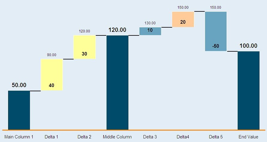 Waterfall chart example from Wikipedia
Wikipedia Public Domain
Waterfall chart example from Wikipedia
Wikipedia Public Domain
As shown above, in each stage, you can see the additive or negative effect to the overall number. So in the case of data, rather than measuring profitability, you measure say number of rows.
Feedback loops in your dataset or model that cause bias/degradation over time
A feedback loop is a difficult to detect problem that really only manifests itself over time. A very common feedback loop in real-life are microphones - you probably may have experienced this when the speakers output a screeching sound, only for the microphone to pick it up and feed it through the speakers again, looping and looping until the sound becomes unbearable and very loud.
The output from one source is the input for another source, which is then re-fed back into the original source.
In data, this occurs where a data system (e.g. ML model) uses the input from a dataset to train and make predictions/conclusions, which results in actions that will affect the original dataset.
Google ML crash course provides a neat example:
- There’s two models that aim to predict the share price of a company - Models A and B
- Model A is buggy and decides to sell a heap of shares in the company
- This massive purchase in turn drives up the share price
- Model B detects this as the ‘share price going down’ and it starts selling shares
- Model A then further detects this share price going down and then this constant loop causes the share price to absolutely tank!
This example is not too farfetched - the 1987 Black Monday stock market crash was caused by faulty algorithms crashing stock prices!
Feedback loops are also the cause of some biased ML algorithms - if historical data shows men are more successful than women in applying for a senior role and the machine learning model is trained on this, the result is:
- the model will conclude, based on historical data, men are more likely to be successful
- the model will in turn favour men and bias against women
- this results in even less women applicants being successful and in turn contribute to an even more biased dataset
- this biased dataset is then re-fed back into the model to train, which will cause even more bias!
Therefore, it is important to know where your data comes in and what influences it - in particular be careful that metrics you are using aren’t influence from the very model you are building.
Closing Thoughts
So hopefully that gives you a bit more insight into some common data science/analytics pitfalls.
Everyone makes mistakes, but being more consciously aware of potential pitfalls makes you a better data scientist/analyst!
 Learning from mistakes
Image by mohamed Hassan from Pixabay
Learning from mistakes
Image by mohamed Hassan from Pixabay
You can continue on this journey in my part 2 blog, which focus on common machine learning pitfalls!