The past dictates the future - or does it?
Forecasting time-series data is different to other forms of machine learning problems due to one main reason - time-series data often is correlated with the past. That is, today's value is influenced by, for example, yesterday's value, last week's value etc. This is known as 'autocorrelation' (ie correlating with 'self').
Because time-series data has autocorrelation, many traditional machine learning algorithm that consider every data point 'independent' don't work well. That is, every prediction is solely based on a particular day's data, and not what happened yesterday, day before etc.
To put it bluntly, traditional machine learning algorithms have no concept of the passage of time - every single data point is just a 'row in the table'. It doesn't factor into trends, which as humans, we would intuitively see (e.g. sales went up by 20% this week).
 Machines look at time differently
Photo by Daniele Levis Pelusi on Unsplash
Machines look at time differently
Photo by Daniele Levis Pelusi on Unsplash
Generally, to make a machine learning model factor data from a particular point's past, you use 'shifting' feature engineering techniques. That is, for example, expressly adding in yesterday's value show as a feature/column for the model to consider.
This illustration will attempt to forecast energy consumption to give a bit of flavour of how time series forecasting works, comparing:
-
Holtwinters Triple Exponential Smoothing
-
Seasonal Autoregression Integrated Moving Average (SARIMA)
-
XGBoost Regressor
-
LASSO Regularisation
-
Facebook’s Prophet
- The past dictates the future - or does it?
- A showcase of time series forecasting - electricity usage!
- Using Machine Learning to Forecast future usage
- Bringing it all together - the final results
A showcase of time series forecasting - electricity usage!
In the electricity industry, being able to forecast the electricity usage in the future is essential and a core part of any electricity retailer's business. The electricity usage of an electricity retailer's customers is generally known as the retailer's 'load' and the usage curve is known as the 'load curve'.
Being able to accurately forecast load is important for a number of reasons:
- Predict the future base load - electricity retailers need to be able to estimate how much electricity they need to buy off the grid in advance.
- Smooth out pricing - if the load is known is advance, electricity retailers can hedge against the price to ensure they aren't caught out when the price skyrockets 3 months into the future.
In a nutshell, the business problem is:
Given the historical power consumption, what is the expected power consumption for the next 365 days?
Because we want to predict the daily load for the next 365 days, there are multiple 'time steps' and this form of forecasting is known as 'multi-step forecasting'. In contrast, if you only wanted to predict the load on the 365th day or the load for tomorrow only, this would be known as a 'one-step forecast'.
PJM Electrical Grid
For this analysis, we will use publicly available for PJM, one of the world's largest wholesale electricity markets, encompassing over 1,000 companies, 65 million customers and delivered 807 terawatt-hours of electricity in 2018.
The dataset is from Kaggle.
We’ll use the PJM East Region dataset - which covers the eastern states of the PJM area. There isn’t readily available data that identifies which regions are covered, so I’m going to assume (for this analysis) the following States (the coastal ones):
- Delaware
- Maryland
- New Jersey
- North Carolina
- Pennsylvania
- Virginia
- District of Columbia
 Electricity!
Photo by Pok Rie from Pexels
Electricity!
Photo by Pok Rie from Pexels
This blog will just summarise the highlights and findings of the adventures of some rudimentary electricity forecasting.
For more details please refer to my Kaggle notebook.
Exploring the Data (i.e. Exploratory Data Analysis)
Visualising the Dataset
Before we begin, let's visually plot the data to understand it a bit better.
Note that the data begins in 2002 and ends in 2018, recording data points at the hourly level. That is a interval frequency of 1 hour.

One thing that jumps out right now is very difficult to see what's going on, as the graph is very 'packed together'.
More 'traditional' econometric/statistical models, such as Holtwinters and SARIMA, require 3 characteristics for them to work properly, namely:
- Seasonality: the dataset is cyclical in nature
- Stationarity: the properties of the dataset doesn't change over time
- Autocorrelation: there is similiar between current and past (ie 'lagged') data points
Seasonal Decomposition
At a high-level, time series data can be thought of as components put together. That is:
Data = Level + Trend + Seasonality + Noise
- Level: the average value in the series.
- Trend: the increasing or decreasing value in the series.
- Seasonality: the repeating short-term cycle in the series.
- Noise/Residual: the random variation in the series.
Using the Python statsmodel library, the above components can be 'decomposed' (ie seasonal decomposition):
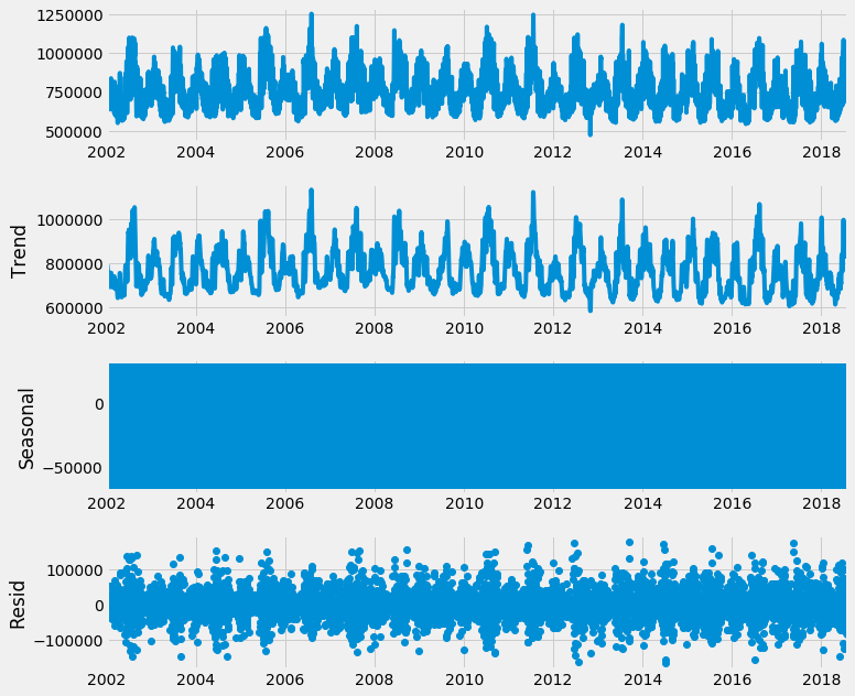 Seasonal Decomposition at the original hourly level
Again, the graph is too packed, so let's aggregate/resample the data to a weekly frequency and try again:
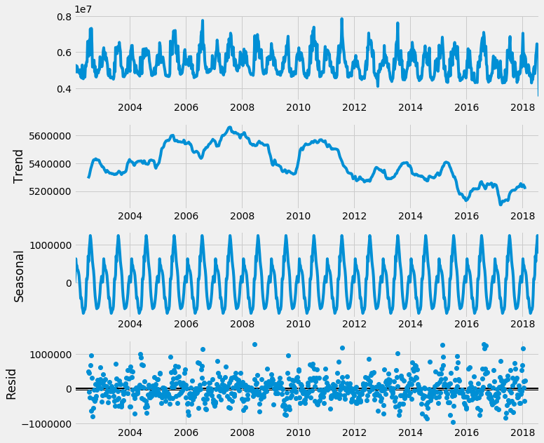 Seasonal Decomposition at the weekly level
You can see start to see a pattern - electricity usage peak and troughs seem to be very seasonal and repetitive. This makes sense, considering office hours, weather patterns, shopping holidays etc.
Furthermore, you can see the trend of the data seems to be trailing downwards in the last few years.
Using heatmaps to visualise seasonality
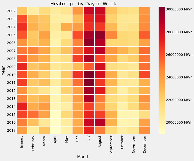
Another way to visualise seasonality is using heatmaps - we can base it on a week to see which days have higher electricity usage.
Note we will drop off 2018 because it’s not a full year and will skewer the heatmap.
Now let’s have a look:
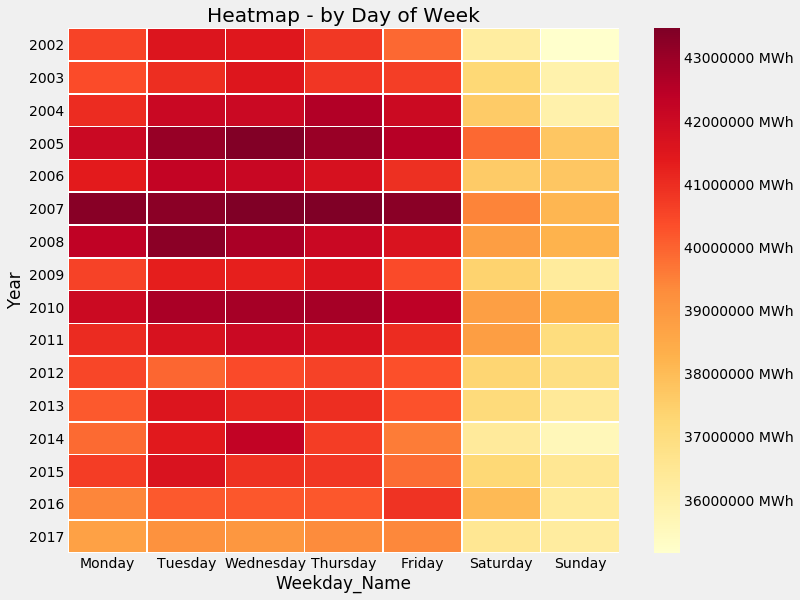 Seasonality Heatmap - Day of Week
So as expected, weekends have less electricity use, as many businesses are closed during the weekend. You can also see that 2007 was a particularly heavy load year too!
But let’s continue on this theme and look at the electricity use for every hour of the day:
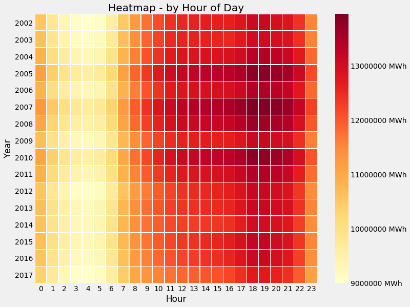 Seasonality Heatmap - Hour of Day
Intersting! It seems the peak operating hours are somewhere between 7am to 10pm, not exactly 9 to 5!
Let’s keep going again - let’s look at a ‘season plot’. That is, a comparison of month by month within a year:
 Seasonality Heatmap - Month
So you can see that July has the heaviest load on the grid - which makes sense as it is the height of summer in the region. January also has a pretty heavy load, but the height of winter too!
Air conditioners are expensive after all!
Comparing with Weather
To further do some analysis, let’s add in weather data. As we are focusing on the PJM East Region, for simplicity, I’ll use Washington D.C.’s weather data as a reference for the entire region.
Weather data was obtained from the US NOAA’s National Centers for Environmental Information (NCEI).
Data is in Celsius degrees and only covers 2016 to 2018. There’s 166 weather stations in the dataset that cover the Washington D.C. region.
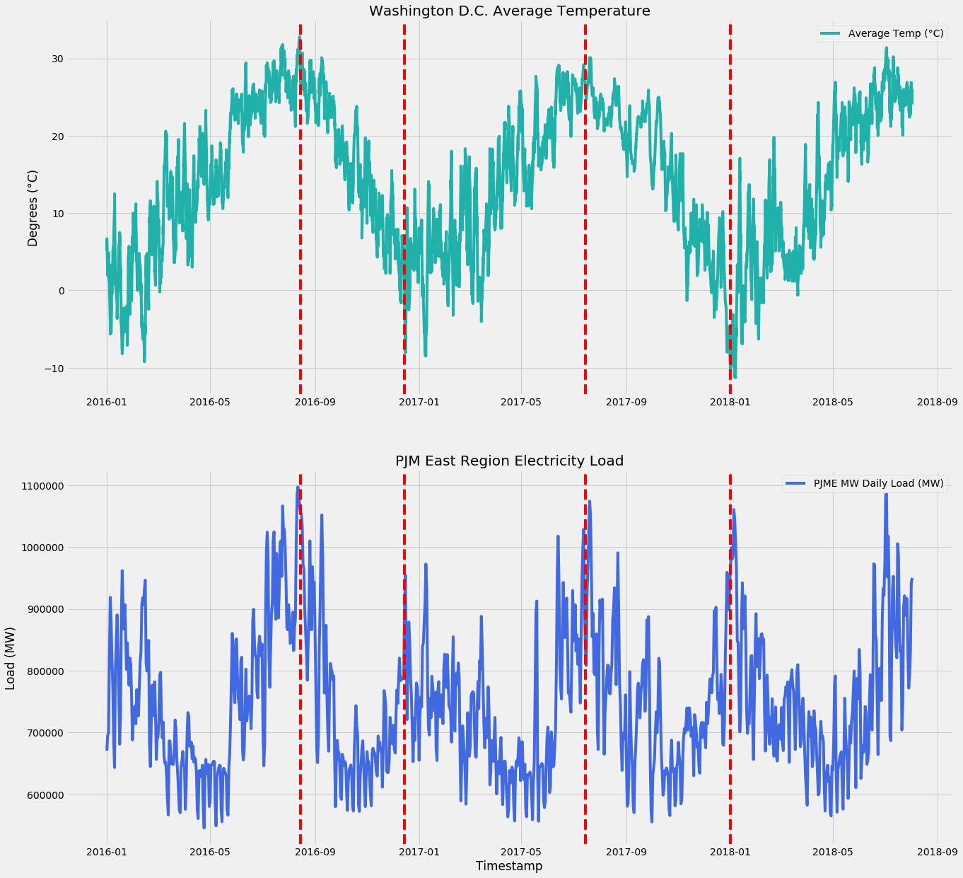 Washington D.C. Weather and PJM East Region Electricity Load
You can see that peaks in weather (super cold or super hot) cause spikes in the electricity load, which is what we are expecting. I added in the red lines to highlight the peaks of temperatures coinciding with peaks in electricity usage.
Interestingly, the correlation between the PJM East Region electricity load and Washington D.C. average temperature is only 13.03%. What this means is, extreme peaks in weather causes spikes, but weather in general isn’t really useful for predicting electricity usage.
Statistical Tests - Stationarity and Homoskedacity
There are certain good statistical tests you can apply to a dataset as a 'smoke alarm' test. They are a good indication whether the data is conducive to accurate forecasting.
'Stationary' means the properties of the dataset don't change over time. Non-stationary means the trends, seasonality changes over time and the data is affected by factors other than the passsage of time. A Non-Stationary is sometimes known as a 'Random Walk' - which are notoriously difficult to forecast, because the underlying properties keep changing (e.g. like trying to hit a moving target).
Note that Random Walk is different to a set of 'random numbers' - it's random because the next point is based on a 'random' modification on the first point (e.g. add, minus, multiply). Whereas in a 'random numbers' set, ther would be little relationship between each data point.
'Homoscedasticity' refers to instances where the data is evenly distributed along a regression line. Basically it means the data is more closely grouped together and therefore is less 'spiky' (ie has more peaks/troughs).
Heteroscedactic data means the peaks and troughs (ie outliers or 'spiky' data points) are being observed way more often than a 'normally distributed' dataset. This means that a model will have a hard time predicting these spikes.
To alleviate this, heteroskedactic data generally needs to be Box-Cox/log transformed to dampen the extreme peaks/troughs. That is, bringing the data closer together so a model can better fit the whole data and hit the peaks/troughs.
Both these statistical tests use Hypothesis Testing and P-Values, which require a cutoff to be picked in advance. The general rule of thumb is 5% - which means there's a only a 5% chance of the statistical tests to be incorrect.
| Statistical Test | Null Hypothesis default position unless prove otherwise |
Alternative Hypothesis need statistical evidence to prove correct |
|---|---|---|
| Stationarity Augmented-Dickey Fuller Test |
Data is not stationary | Data is stationary |
| Homoskedacity Breush Pagan Test |
Data is not heteroskedactic (ie homoscedactic) | Data is heteroskedactic. |
| P-Value | Greater than 0.05 | Less than 0.05 |
| What P-Value means | There is no statistical evidence the hypothesis is true. | There is statistical evidence the hypothesis is true. Furthermore, there is only a 5% chance this hypothesis was incorrect proven by accident. |
In our case, we got the following results:
| Statistical Test | P-Value | What this means |
|---|---|---|
| Stationarity | 0.00000000000058695232 | There's statistical evidence the dataset is stationary. |
| Heteroskedacity | 0.24804938724348729595 | There's statistical evidence the dataset is heteroskedactic. |
The consequences of these tests means that the traditional assumptions of linear regression have been violated. That is, more conventional methods of linear regression, statistical F-Tests and T-Tests become ineffective.
Therefore, this forecasting model won’t factor in these tests.
Autocorrelation
Autocorrelation is basically how much correlation there is between a particular time point and a prior one - e.g. today’s value is highly correleated with last week’s value.
Again, Python Statsmodel has a great Autocorrelation Function (ACF) that easily produces this:
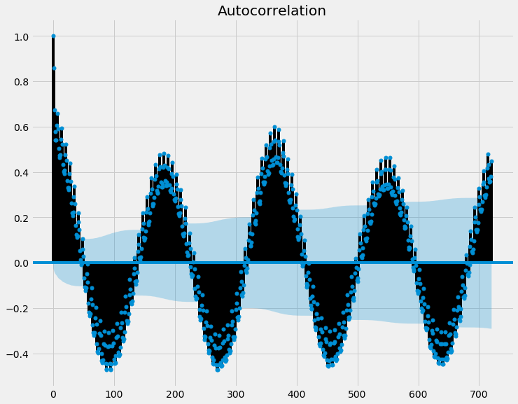 Autocorrelation Function
What the above graph shows is how correlated a prior point is to the current point. The further the number is away from 0, the more correlation there is.
Generally, we would only consider any points above (for positive numbers) and below (for negative numbers) the blue shaded area (the confidence interval) as statistically significant and worth noting.
This shows that yesterday’s value has a very high correlation with today’s value and there is seasonality - every 6 months it seems to repeat itself.
As eluded earlier, this makes sense if you factor in weather patterns - winter and summer have higher electricity usage due to more heat/cooling needed.
Another modification of this autocorrelation analysis is the Partial Autocorrelation Function (PACF). This function is a variant of ACF, as it finds correlation of the residuals, after removing the effects which are already explained in earlier lags. That way, you don’t get a ‘compounding’ correlation effect.
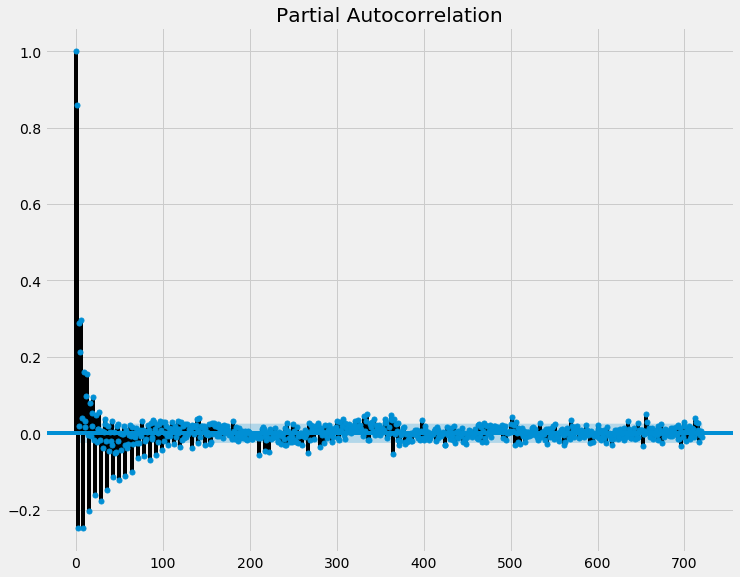 Partial Autocorrelation Function
This graph shows that the last 90 days have a stronger correlation, but the effect becomes much less obvious the further back you go.
Developing a Baseline Forecast
Before we go knee-deep into machine learning, it is good to use naive forecasting techniques to determine a 'baseline'. That is, if the ML models cannot beat these baseline forecasts, then we would be better off just using naive forecast instead.
They are 'naive' in the sense they are simple to apply, but in reality they are pretty powerful and effective forecasts. Not too many ML models actually can consistently beat a naive forecast!
A common naive forecast for predicting a multi-step forecast (i.e. for us, it would be the next 365 days), is to use a 'One-Year-Ago Persistent Forecast'. This basically means the value for say 31 August 2019 is predicted using the value for 31 August 2018.
Using this method, we get the following results:
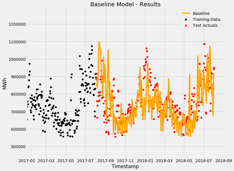 Baseline Forecast - One-Year-Ago Persistence Model
Immediately you can see that it is pretty half-decent forecast! Now we need to see the errors/residuals to figure out whether:
-
It is normally distributed (i.e. it has no bias to under or over forecasting)
-
Whether the errors are autocorrelated (that is, whether the model failed to pick up on any autocorrelation patterns). The idea is if the model did it’s job, there shouldn’t be any autocorrelation left in the errors.
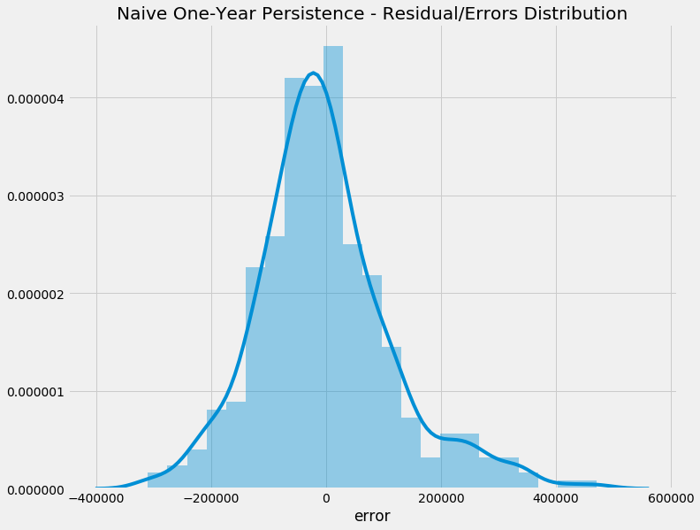 Naive Model - Error Distribution
This is quite good! It means that most of the errors are centred around zero - so the model isn’t leaning towards over or under forecasting. Now let’s look at the autocorrelation of the errors:
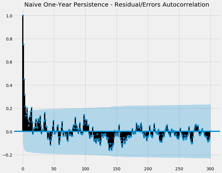 Naive Model - ACF
Again, half decent! There’s not many points outside of the blue shaded area, meaning there’s not many statistically significant autocorrelation between the errors. It means the model hasn’t majorly failed on picking up autocorrelation patterns!
Using Machine Learning to Forecast future usage
Another interesting aspect in time series forecasting is you need to accept your forecasts will be wrong. The only question is how wrong. This means your model needs to be able to identify the following:
-
Distribution of the residual/noise (as discussed above) - generally you want the residual to be:
a. Uncorrelated with each other (i.e. no autocorrelation)
b. Normally distributed around zero (i.e. zero mean) - meaning it is unbiased and doesn’t lean towards under-forecasting or over-forecasting
-
Confidence interval - generally the 80% or 95% intervals are shown (that is, the model is 80 or 95% confident the actual result will land in this range)
Traditional machine learning algorithms usually do not provide evaluation of the above, so therefore they need to be calculated as part of the model. We'll keep this in mind for the following few algorithms.
Triple Exponential Smoothing
First we will use Holtwinter's Triple Exponential Smoothing: a time series forecasting model that takes advantage of the above identified components.
This is known as a 'generalized additive model', as the final forecast value is 'adding' together multiple components.
Holtwinters works really well when the data is seasonal and has trends.
The 'Triple' refers to the three components:
Data = Level + Trend + Seasonality
The 'smoothing' basically refers to a technique where more weight is put on more recent data compared to the past.
If a 'Multiplicative' approach is taken, rather than an 'Additive' approach, the formula is rejigged to be:
Data = Level x Trend x Seasonality
Let's try Holtwinters at the daily level, rather than hourly level, as when data is aggregated to a higher level, a natural 'smoothing' occurs as the data averages out more over time.
Results
Using Holtwinters, data from 2002 to 2017 was used to train the model, while the remaining 2017 to 2018 data was used to test/evaluate the model's accuracy.
Training data is in black, while test/evaluation data is in red.
The actual forecast model is in orange.
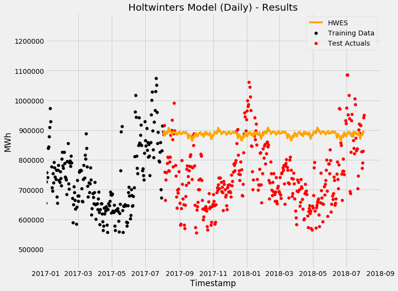 Holtwinters - not particularly accurate in this case
So it seems Exponential Smoothing is a no-go - let's see how the others fare.
Extreme Gradient Boost Model (XGBoost)
XGBoost has gained in popularity recently by being quite good at predicting many different types of problems.
Normally with decision-tree models, you would get the data and create one tree for it. This of course means it is very prone to overfitting and being confused by the unique tendencies of the past data.
To overcome this, you do 'gradient boosting'. At a very high-level, it is analogous to the algorithm creating a decision tree to try to predict the result, figure out how wrong it was, and then create another tree that learns from the first one's 'mistakes'.
This process is then repeated a few hundreds or even a few thousand times, with each tree being 'boosted' by the prior one's mistakes. The algorithm keeps going until it stops improving itself.
The technical aspects of the mathematics are much more complex (and a bit beyond my knowledge to be honest). If you want more details, the documentation is here.
Feature Engineering
As eluded earlier, most machine learning models don't 'look back' to prior values. Essentially if you have a table, each 'row' is an independent data point and the ML model doesn't consider the prior row's data.
This is problematic for time series data, as shown above, autocorrelation happens.
To address this issue, we use feature engineering to create additional features - in this case, I created 365 extra columns each prior day. Today minus 1 day, Today minus 2 days ... until Today minus 365 days.
 Day 1, Day 2….and etc etc.
Photo by Pixabay from Pexels
Day 1, Day 2….and etc etc.
Photo by Pixabay from Pexels
Training the Model
To train the model, again I split the data into two parts: Training from 2002 to 2017 and Evaluation/Testing from 2017 to 2018.
In this case, I used 1000 runs and a maximum depth of each tree to be 6. That is, it does 1000 runs (or less if it stops improving), with each tree having a max of 6 levels.
As a tree-based algorithm, generally XGBoost doesn't handle trends in data well compared to linear models. However, given as shown above in the ADF test, the data is stationary, trend is not really an issue and we can proceed. Otherwise we would need to de-trend the data first as part of preprocessing.
 That’s a lot of trees!
Photo by Jaymantri from Pexels
That’s a lot of trees!
Photo by Jaymantri from Pexels
Results
The results of the model are fairly accurate!
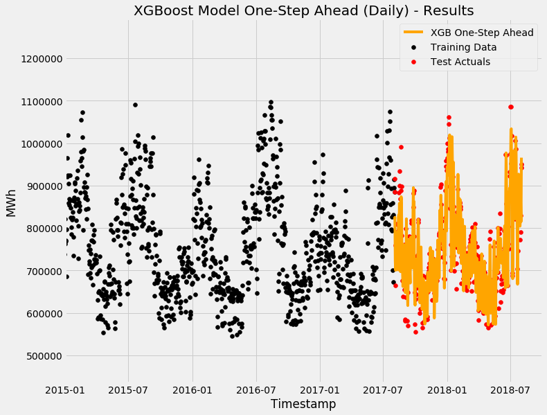 XGBoost One-Step Ahead Forecast
However, caveat is that because the model knows about yesterday's value. Therefore, the 'forecast horizon' (ie the maximum length of time it can predict into the future) is only 1 day. This is also known as a 'One-Step Ahead Forecast'.
If you only have yesterday's value, you can only predict today's value. If you only have today's value, you can only predict tomorrow's value.
Feature importance
Now let's see what the algorithm considered most important - we'll grab the Top 10 features by weight.
The weight is the percentage representing the relative number of times a particular feature occurs in the trees of the model. It's a rough way of saying the more times you reference a particular feature, the more likely it is important.
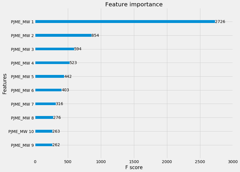 Feature Importance by Weight
Seems like yesterday's value is the biggest factor in determining today's value! This, again, makes sense, given how the autocorrelation function showed yesterday's value had the biggest correlation with today's value.
An alternative feature engineering approach - let’s not include lag
Let's try to make the XGBoost model more than One-Step Ahead - we'll only feature engineer:
- Day of the Week
- Day of the Month
- Day of the Year
- Week of the Year
- Month
- Year
Hopefully this is enough for the model to artificially pick up 'seasonality' factors - e.g., if same day of week, might be correlated.
Results
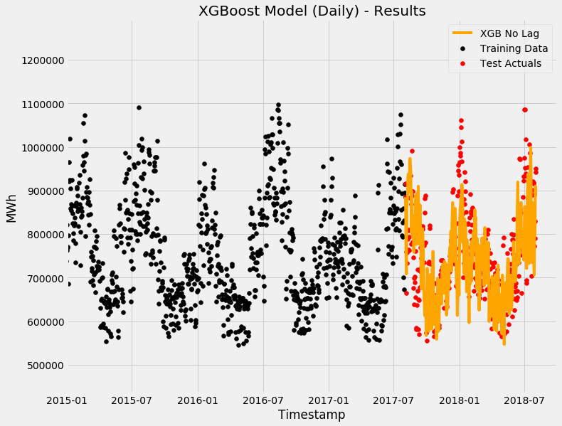 XGBoost Model without Autoregression Factors
Furthermore, feature importance by gain - gain is essentially how much each feature contributes to the 'improvement' of the tree.
 Feature Importance by Gain
Overall, quite good results! Now let's have a look at the residuals/errors.
First let's look at the distribution of the errors - remember, the ideal state is the errors are centred around zero (meaning the model does n't particularly over or under forecast in a biased way):
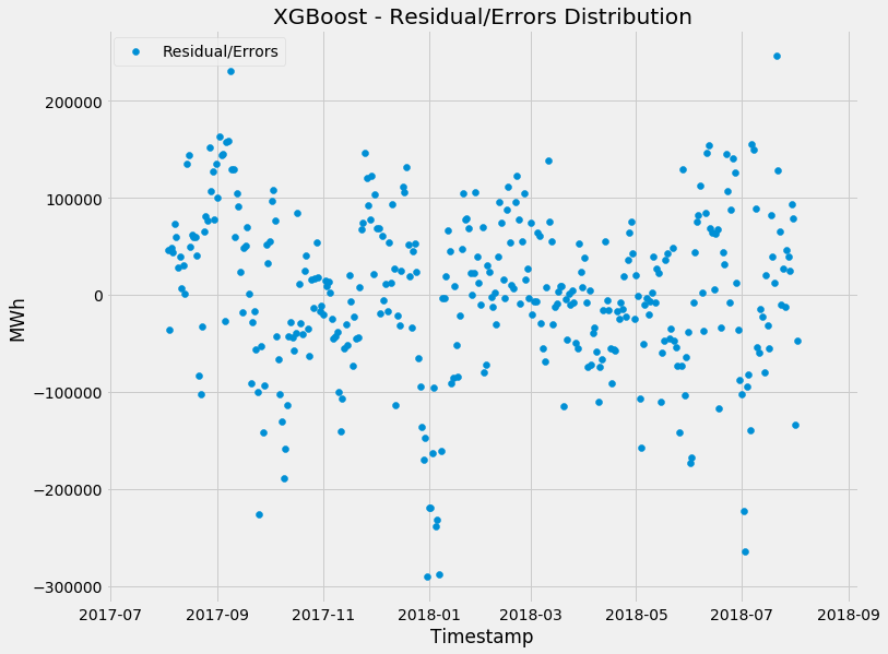
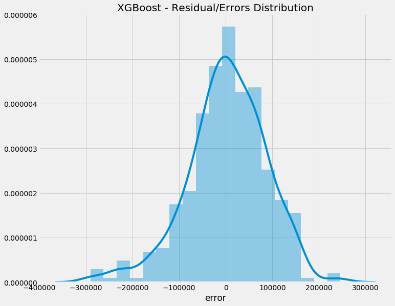
So looking quite good - you can see some forecasts were pretty off (particularly for spikes), but overall, it seems the model treats overs and under equal.
Now let's see the autocorrelation of the errors:
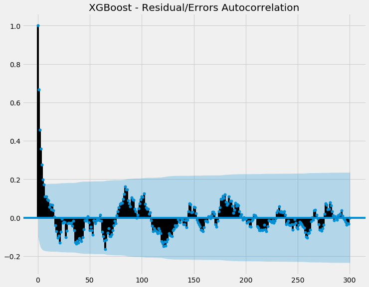
So most of the points are within the shaded blue (ie confidence interval), indicating there's no statistically significant autocorrelation going on. This is good, as if there was autocorrelation with our errors, it means there's some autocorrelation our model is failing to capture.
LASSO (L1) Regression
Next we will use LASSO, which stands for Least Absolute Shrinkage and Selection Operator. It is a ‘Generalised Linear Model’, which means it is a flexible generalisation of ordinary linear models which can be applied to data that otherwise wouldn’t be appropiate for linear regression.
LASSO regression incorporates regularisation and feature selection into its algorithm, meaning that it will penalise the ‘irrelevant’ features by effectively by ‘zeroing’ out those features (by multiplying it with a 0 coefficient). That way, the noise from the data doesn’t over-complicate the overall model.
The main hyperparameter to tune is the penalty factor (i.e. lambda or alpha). A factor of 0 means no penalisation occurs, and it effectively just does an Ordinary-Least-Squares (OLS) regression.
Since we’ve already set up all the train-test split (as well as feature engineering) in the prior XGBoost model, we can just re-use it. However, unlike the decision tree-based XGBoost, linear regression is sensitive to scale. Therefore, we also need to scale the data.
Results
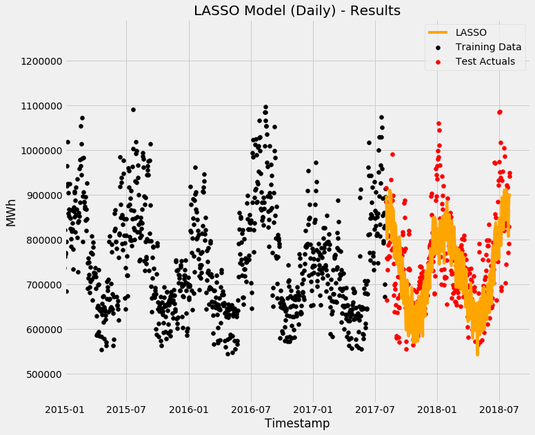 LASSO Regularisation
Next let's see feature importance by way of coefficients - we'll only get Top 10. Remember, LASSO will 'zero-out' irrelevant features, so in this case, these are the Top 10 features that LASSO considers are most important.
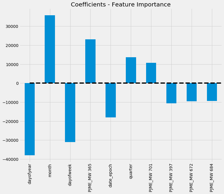 LASSO - Feature Importance by Coefficient
So LASSO is producing half decent results! Now let's have a look at the residuals/errors.
Let's look at the distribution of the errors - remember, the ideal state is the errors are centred around zero (meaning the model does n't particularly over or under forecast in a biased way):
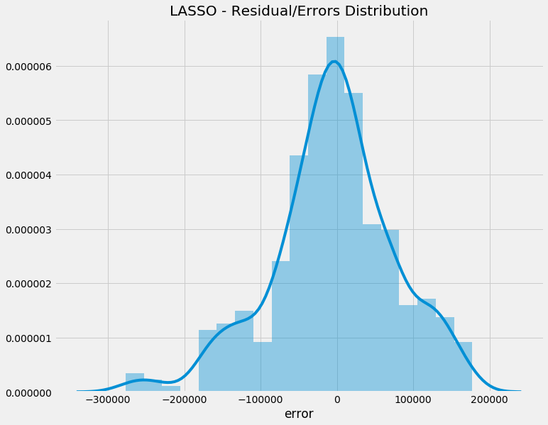
Interestingly, LASSO's error distribution mean is smack-bang on zero - which is exactly what you want to see!
Now let's see the autocorrelation of the errors:
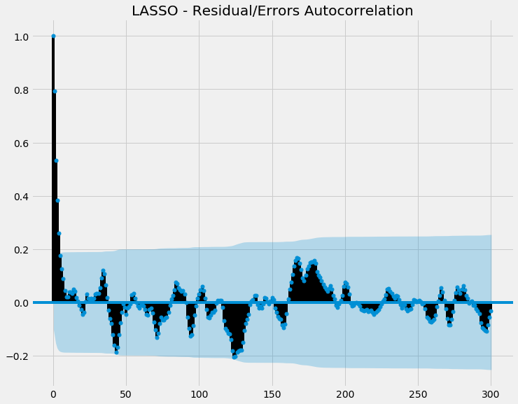
So most of the points are within the shaded blue (ie confidence interval), indicating there's no statistically significant autocorrelation going on. This is good, as if there was autocorrelation with our errors, it means there's some autocorrelation our model is failing to capture.
Seasonal Autoregression Integrated Moving Average (SARIMA)
The conventional ARIMA model assumes that the historical data are useful to predict the value at the next time step. In this case, this is somewhat true, as the ACF plot before showed past value is somewhat correlated with today's value.
ARIMA basically integrates two naive forecasting techniques together:
- Autoregression - Uses one or more past values to forecast the future. The number of values used is known as the 'order' (e.g. order 2 means yesterday and day before's value is used)
- Integrating - the part that reduces seasonality. How many degrees of differencing is done to reduce seasonality is the 'order'.
- Moving Average - Uses the Moving Average of the historical data to adjust the forecasted values. This has a 'smoothing' effect on the past data, as it uses the moving average rather than the actual values of the past. The number of days in the moving average window is the 'order'.
SARIMA then adds a 'seasonality' flavour to the ARIMA model - it factors in trends and seasonality, as explained above.
Results
Like Holtwinters, the training and testing data was split between 2002 to 2017 and 2017 to 2018.
The results were as follows:

So you can see that despite some tuning, the results are not particularly good. The confidence interval is very big, indicating the model has is not 'confident' in the prediction either.
SARIMA
A further breakdown of the components of the SARIMA model shows:

Importantly, the model should have the residuals uncorrelated and normally distributed (ie the mean should be zero). That is the, the centre point of the residuals should be zero and the distribution plot (KDE) should also be centred on 0.
Facebook Prophet
Lastly, we will use Facebook Prophet - an open-source library that is also a generalised additive model (ie final result is made up of multiple components added together).
It’s all about probabilities!
Unlike regular Generalised Linear Models, Facebook Prophet's uses a Bayesian curve fitting approach. The concept of Bayesian theorem is, at high level, trying to determine the probability of related events given knowledge/assumptions you already know (ie 'priors').
This is basically fancy talk for saying it focuses on finding a bunch of possible parameters and the probability of each one rather than finding fixed optimal values for the model. How certain (or uncertain) the model is about each possible parameter is known as the 'uncertainty interval' - the less data the model sees, the bigger the interval is.
The sources of uncertainty that Prophet's Bayesian approach aims to address are:
- Uncertainty of the predicted value
- Uncertainty of the trend and trend changes
- Uncertainty of additional noise
You can see an example in my previous post on using Prophet to forecast Brisbane weather data. Essentially, as you can see in the graph below, when it analyses past data, Prophet is always trying to figure out the uncertainty/probability.
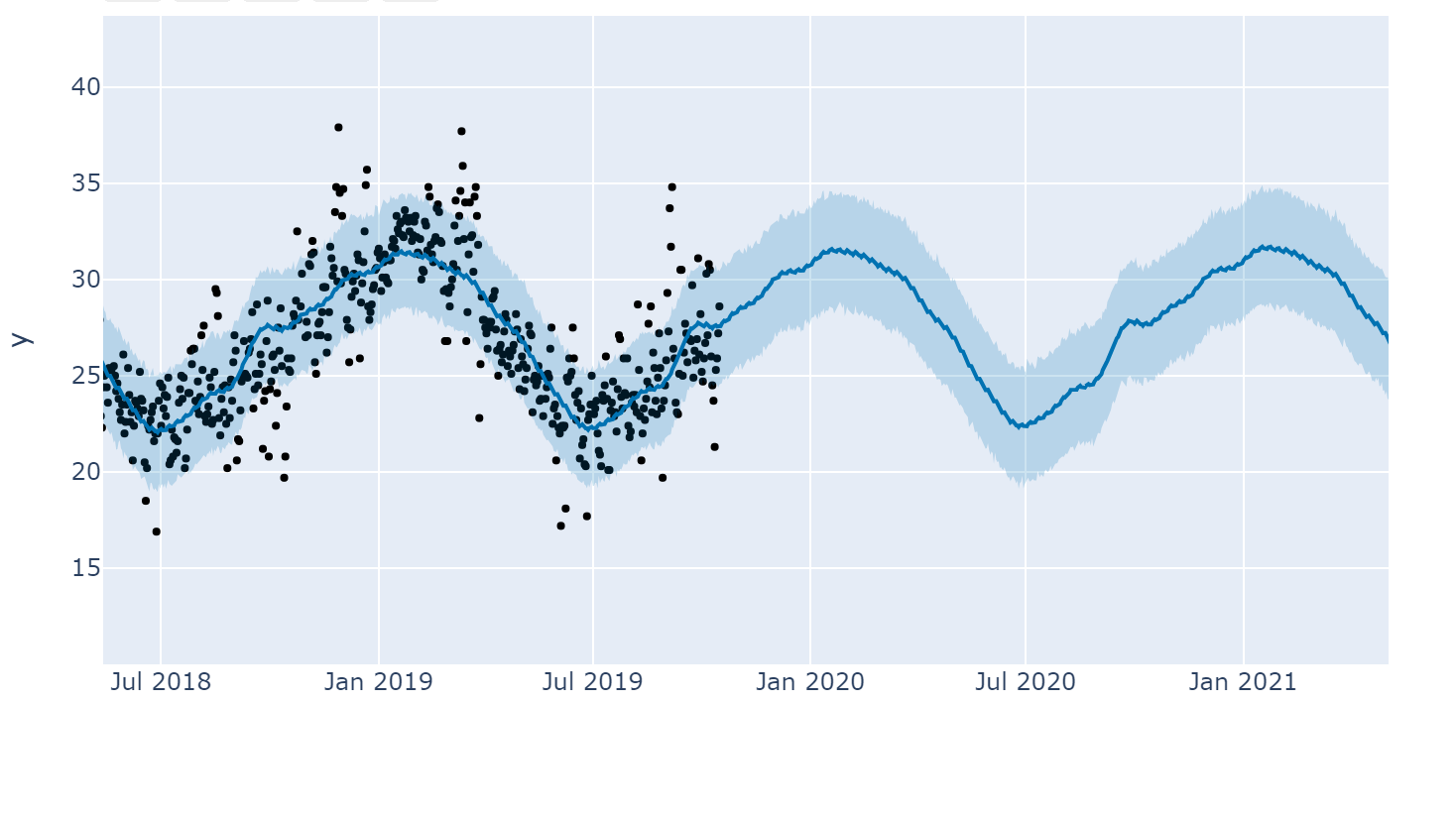 Prophet predicting Weather - notice the shaded blue section showing the uncertainty interval
So rather than trying to fit the line that goes between all the black dots, it's trying to fit the blue shaded area that tries to hit as many black dots as possible.
Trends, ‘Changepoints’ and Seasonality
Prophet is different to SARIMA and HoltWinters, as it essentially decomposes time series differently by:
Data = Trend +/x Seasonality +/x Holidays +/x Noise
In Prophet, trend represents non-periodic changes while seasonality represents periodic changes. Where it differs from other statistic models like SARIMA and Holtwinters is Prophet factors in the uncertainty of trends changing.
Interestingly, Prophet fits a curve to each component independently (ie fits a regression for each component with time as independent variable). That is:
- Trend - fits piece-wise linear/log curve
- Seasonality - uses fourier series
- Holidays - uses constant/fixed values
Prophet reacts to changes in trends by 'changepoints' - that is sudden and abrupt changes in the trend. An example, is the release of a new electric car that will impact sale of petrol cars.
How 'reactive'/flexible Prophet is to changepoints will impact how much fluctation the model will do. For example, when the changepoint scale is to very high, it becomes very sensitive and any small changes to the trend will be picked up. Consequently, the sensitive model may detect spikes that won't amount to anything, while an insensitive model may miss spikes altogether.
 All about trends!
Photo by Frank Busch on Unsplash
All about trends!
Photo by Frank Busch on Unsplash
The uncertainty of the predictions is determined by the number of changepoints and the flexibility of the changepoint allowed. In other words, if there were many changes in the past, there's likely going to be many changes in the future. Prophet gets the uncertainty by randomly sampling changepoints and seeing what happened before and after.
Furthermore, Prophet factors in seasonality by considering both its length (ie seasonal period) and its frequency (ie its 'fourier order'). For example, if something keeps happening every week on Monday, the period is 7 days and its frequency is 52 times a year.
There's also a function for Prophet to consider additional factors (e.g. holidays), but for the purposes of this forecast we won't use it.
Training
Prophet works quite well out of the box, so I just stuck with the default hyperparameters.
The results can be seen below, with the black dots representing historical points and the blue line representing the prediction:
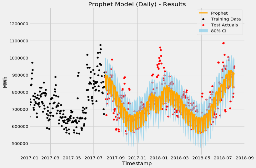
You can see the 80% confidence interval (in light blue), indicating the model is confident that 80% of the actual data will land in that predicted range.
As with Holtwinters, we can do a decomposition to see the components:
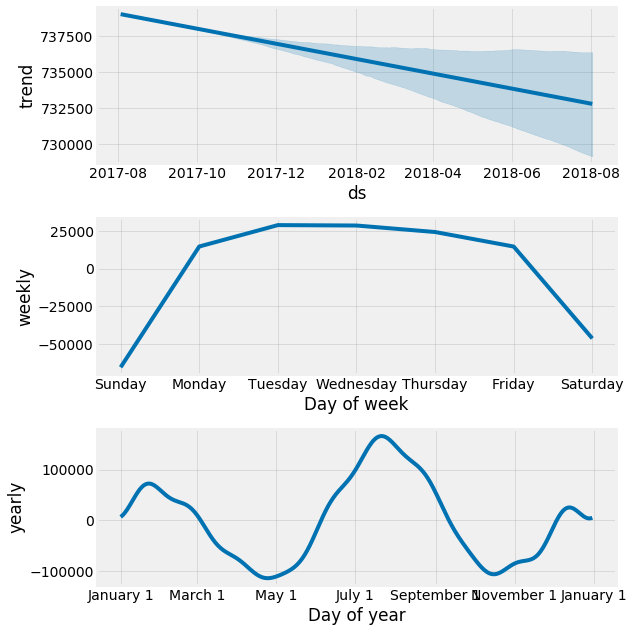
Now let's evaluate the residuals and see whether the model is biased in any way. Remember, ideal state is the errors are centred around zero and there's no autocorrelation:
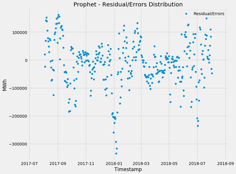
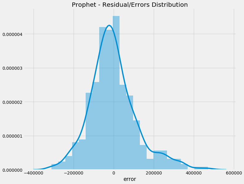
Again, you can see that the errors seem to be distributed around zero and there's no statistically significant autocorrelation going on. This indicates that the model isn't biased and not leaning torwards under or over forecasting.
However, you can see that the model does seem to miss under forecast a bit more, particularly for spikes. Let's have a closer look at the biggest under forecasts:
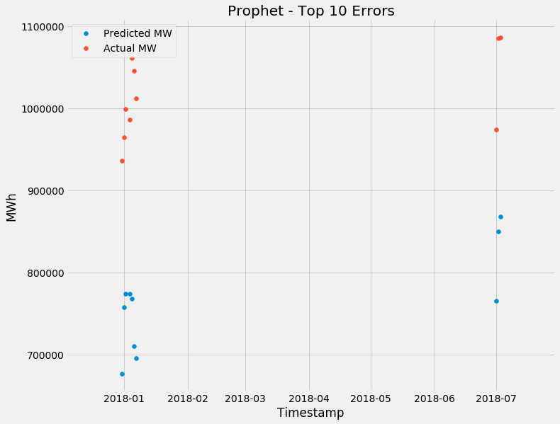
There's a common theme, the model seems to always get the 1st of every month incorrect. The most incorrect days were July and January, the peak of summer and winter respectively. Makes sense - You get the biggest peaks in these periods due to weather.
Bringing it all together - the final results
Finally, Let's bring the models together and see which one did the best:
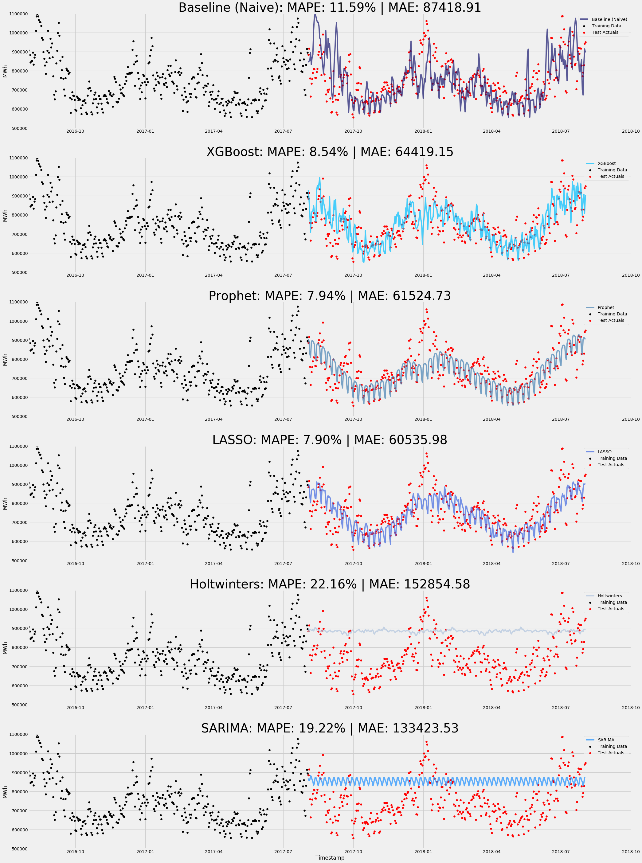 Final results!
The Final Mean Absolute Error metrics between models:
- Baseline: 87,418.91
- XGBoost One-Step Ahead: 43,437.22
- Prophet: 61,524.73
- XGBoost: 64,419.15
- LASSO: 60,535.98
- SARIMA: 133,423.53
- HoltWinters: 152,854.58
Mean Absolute Error (MAE) is an evaluation metric that measures the average magnitude of the errors in a set of predictions. In other words how wrong the model is. Unlike other metrics, such as Root Mean Squared Error, it does not have any particular weighting.
Now let’s also look at Mean Absolute Percentage Error (MAPE). MAPE is essentially the error expressed as a percentage of the actual value. For example, if the actual value is 100 and the prediction is 105, then the error is 5 (5% of the actual value).
Unlike MAE, MAPE has issues in its calculations, namely when the actual value is 0 (can’t divide by zero) and negative values can’t go beyond -100%.
Regardless, MAPE is a good ‘sense-check’ to see which model is proportionally better.
The Final Mean Absolute Percentage Error between models:
- Baseline: 11.59%
- XGBoost One-Step Ahead: 5.78%
- Prophet: 7.94%
- XGBoost: 8.54%
- LASSO: 7.90%
- SARIMA: 19.22%
- Holtwinters: 22.16%
The lower the error the better/more accurate the model is, so therefore in this case, XGBoost One-Step Ahead was the most accurate. However, this is because the forecast horizon is only one day and you would expect it to be pretty accurate. Therefore, it wouldn't be fair to compare one-step ahead with the other forecasting models.
In light of this, the winner is LASSO! However, Prophet and XGBoost still come a pretty close second and third!
You can see that there was a lot of noise in this dataset and while there's high seasonality, more conventional statistical approaches, such as Holtwinters and SARIMA weren't able to get through all that noise.
Interestingly, all the forecasting models beat the baseline, except SARIMA and Holtwinters. This does at least demonstrate that we are still better off using these models than just doing naive forecasting.
Hopefully that gives you a bit of a flavour to time series forecasting and some of the unique aspects of it!