From Zero to Data
The Beginnings
Tracking personal spending is a track that many of us do to make sure we’re not exceeding our own budgets. So many years ago, I began to track my spending on entertainment products, such as movies, video games, etc. As with many data or finance projects, the original version was a simple Excel Spreadsheet. Now, Microsoft Excel is a powerful tool and I still use it quite a lot, but anyone who has tried to do visualisation with Excel knows it’s not the most appropriate tool for it.
Version 1.0, as I call it, consisted of a data table, Pivot Tables, Pivot Charts and Slicers. I could only view it in my PC and I couldn’t do a lot of more complex visualisations, such as budget targets.
 Money! Spending!
Photo by Pixabay on Pexels
Money! Spending!
Photo by Pixabay on Pexels
Enter Tableau and Google Sheets
Eventually I know I had to move to a more powerful data visualisation too, so I settled with Tableau. It’s more of a personal preference to use it, compared with other viz tools (e.g. PowerBI). Through Tableau, I began to make even more complex visualisations.
Tableau Public is a free version of Tableau, which has most of the visualisation feature of Tableau Desktop. All your visualisations are hosted on their servers. The main catch is you can’t save local copies and the data sources are limited.
To further move into a more ‘cloud’-like setup, I eventually migrated my entire spreadsheet into Google Sheets. Google Sheets is similiar to Excel, but part of the G Suite (similiar to Microsoft Office). The basic online version is free, similiar to Excel Online.
This allowed Tableau Public to connect to it and do a daily refresh. It also freed me from having to constantly be on the same PC to open the same file.
 Tableau Public and Google Sheets
I went through many iterations of the dashboard and eventually settled on this version. I’m now able to create some insightful visualisations in Tableau (integrated with Google Sheets) that show how much I spend every year!
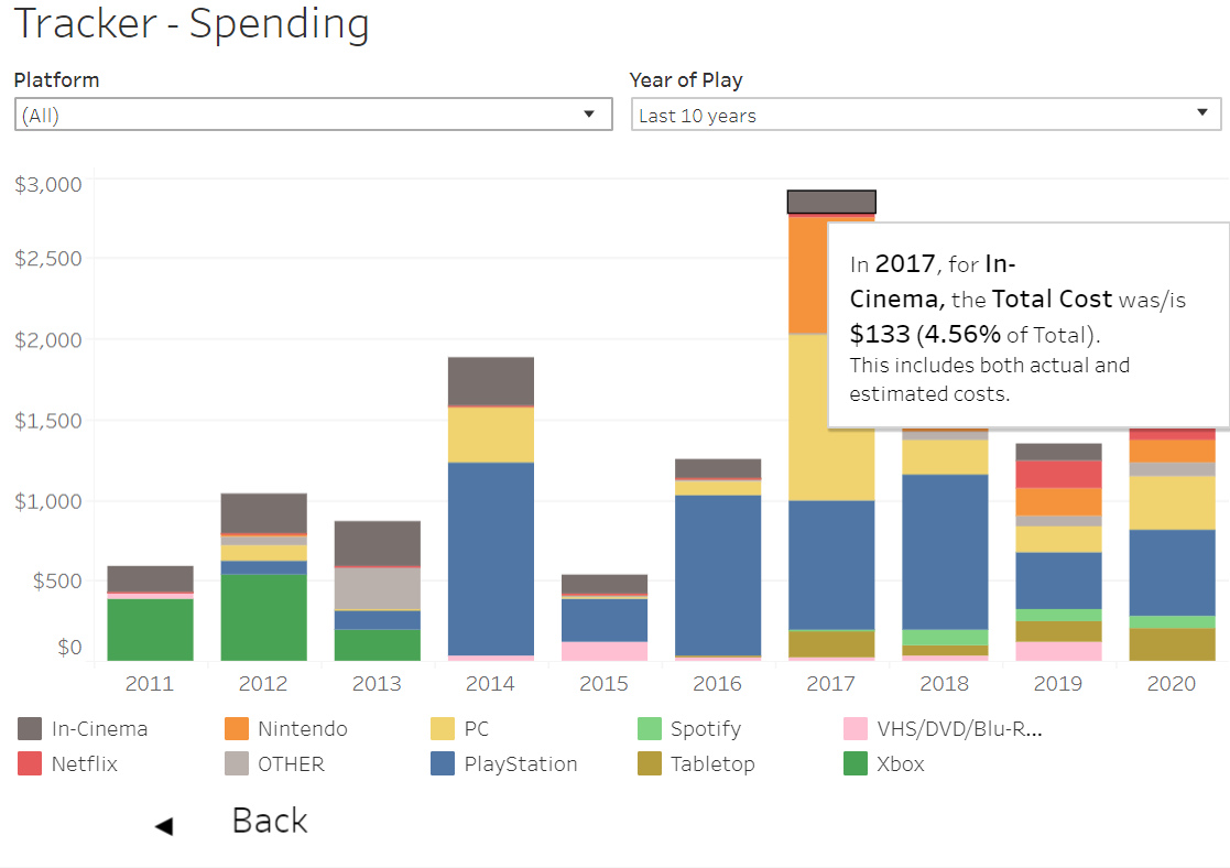 Interesting observations! I sure spend a lot on random stuff!
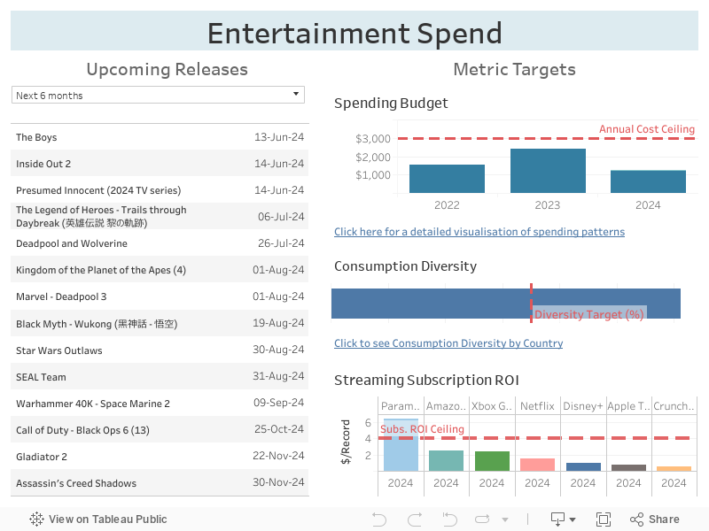
Tableau also has mobile-friendly layouts, which lets you customise what you see. If you use a mobile device, you would see something similiar to below:
 Mobile Devices have less screen ‘real estate’
The Dashboard
Tableau even lets you have embedded visualisations, so now you can also have a look at the visualisations. Feel free to have a play with the dashboard below!
Closing Thoughts
This dashboard holds a more personal place in my portfolio, as it was one of the many data projects that followed me since I began on my data journey.